UNDISCLOSED COMPANY
This company needed a face lift from their previous design. The original design was based on the old style of mobile/desktop – 2 sites.
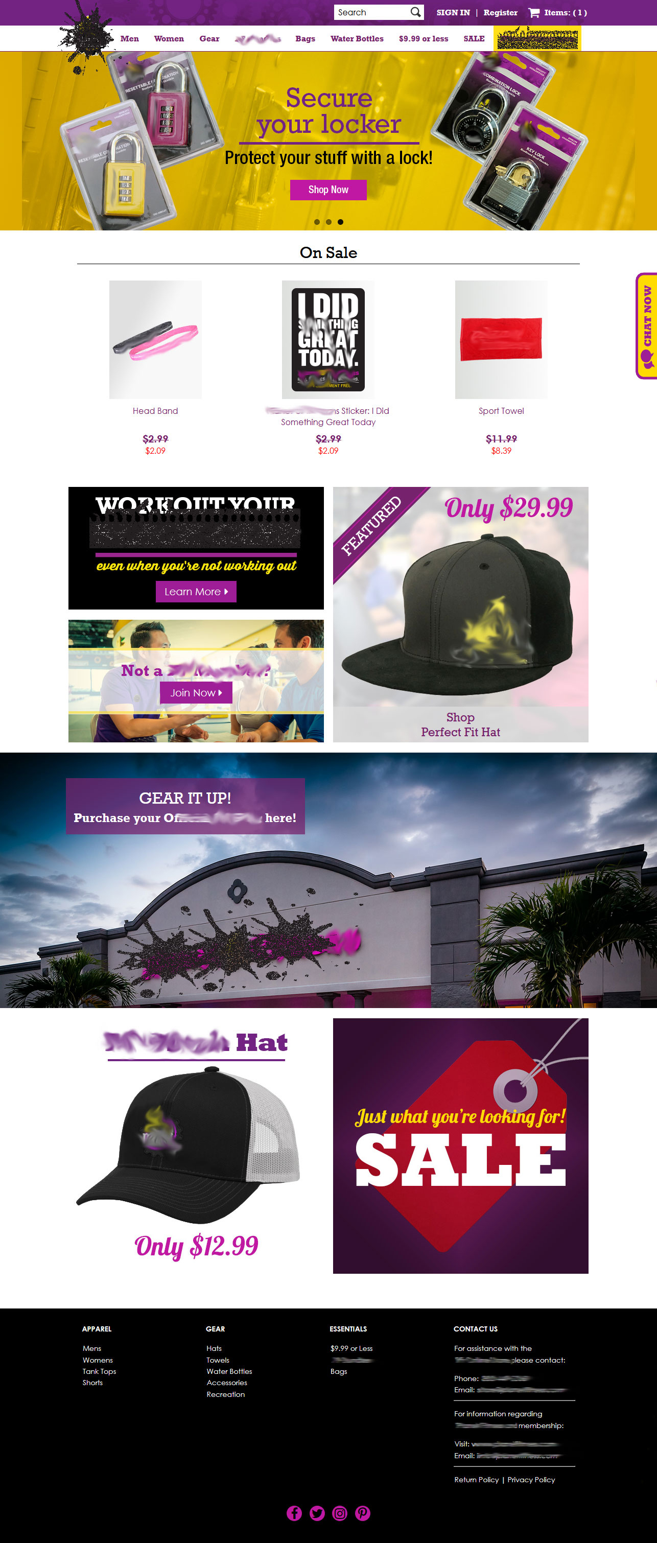
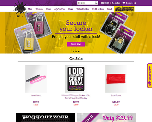
We had to create a responsive design that was versatile enough where sectioning made sense if the client wanted to switch things around – and they did!
We discovered that over 60% of the visitors were on mobile devices, which meant that a responsive design needed to concentrate more on mobile use rather than desktop to ensure a better experience overall.
The work resulted in a solid strategy and implementation road map for a the company’s digital web presence.
SOLUTION
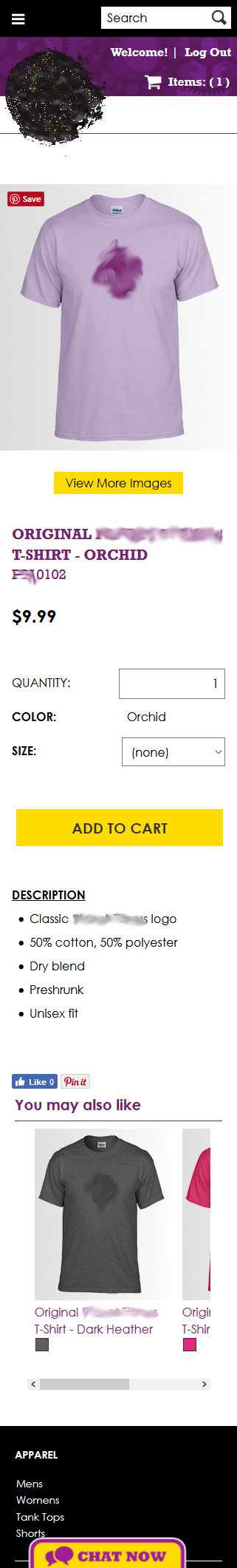
Knowing the CMS being used was the biggest challenge, we were able to create the versatile design for both desktop and mobile devices.
The major overhaul included:
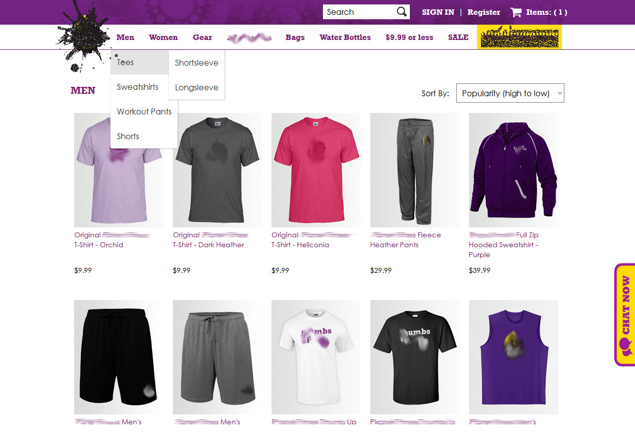
- Responsive design
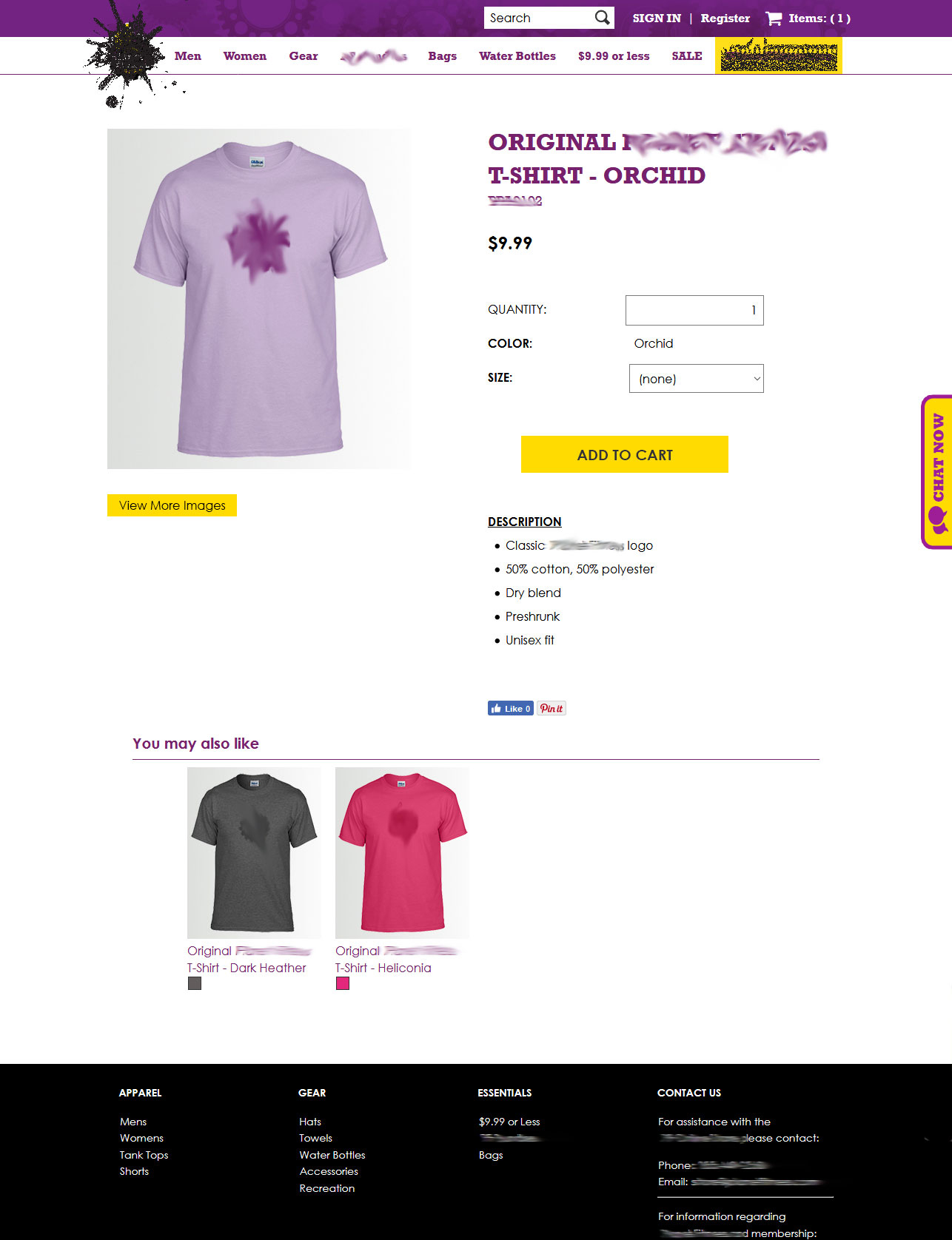
- Sections to move or duplicate the messages
- Creating an open spaced design with less clutter so the user can find what they wanted
- Simple messages to the customers using less text
- Limited use of sliders – we chose 4
- A single site with a single database rather than the old 2 site method
RESULTS
The company used Essent’s SiteBuilder Pro CMS platform, which can be quite difficult to use at times.
The platform itself can be manipulated, but very carefully. Due to its limitations, the design still came out as a success.
Drop off rates decreased by an expected 10-15% from a whopping 75% to about 60-65%. While this seems VERY high, the majority of the users were inquiring about memberships rather than store inquires. We assumed about 30% of the users were looking for information about the gym itself, just by click-throughs.
ADDITIONAL THOUGHT & IMAGES
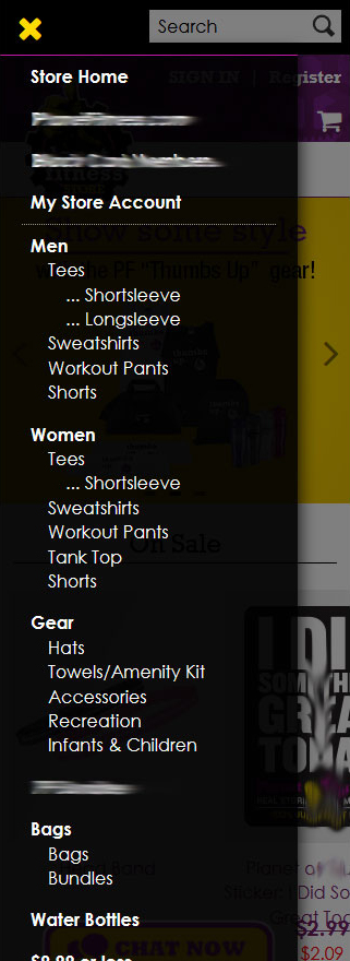
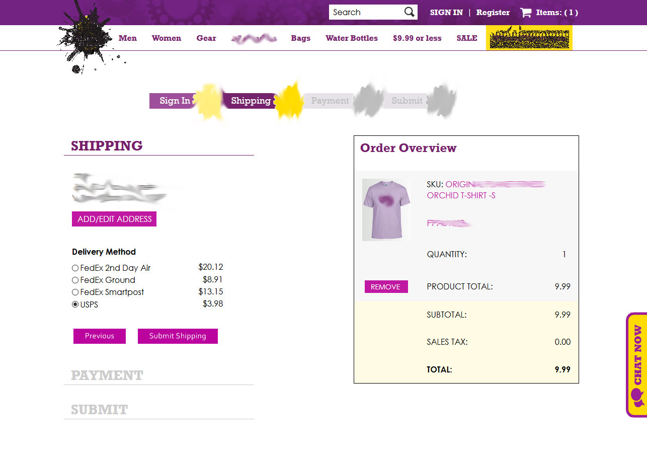
As you can see from the UI, there are clear paths to each page. The flow of the site lessens the user from getting “lost”.