Client:
UNDISCLOSED
Problem:
Client had a web design that needed a revamp to meet today’s standards. With search engines changing their algorithms, something needed to be done. They had a mobile site, but it was outdated. They used a different website for mobile.
The desktop version of the site was very clunky. The client wanted to add more to the navigation, but due to the build it was impossible.
Their eCommerce checkout was very hard to understand and a bit confusing. A user was unsure if they were purchasing or checking their account.
Solution:
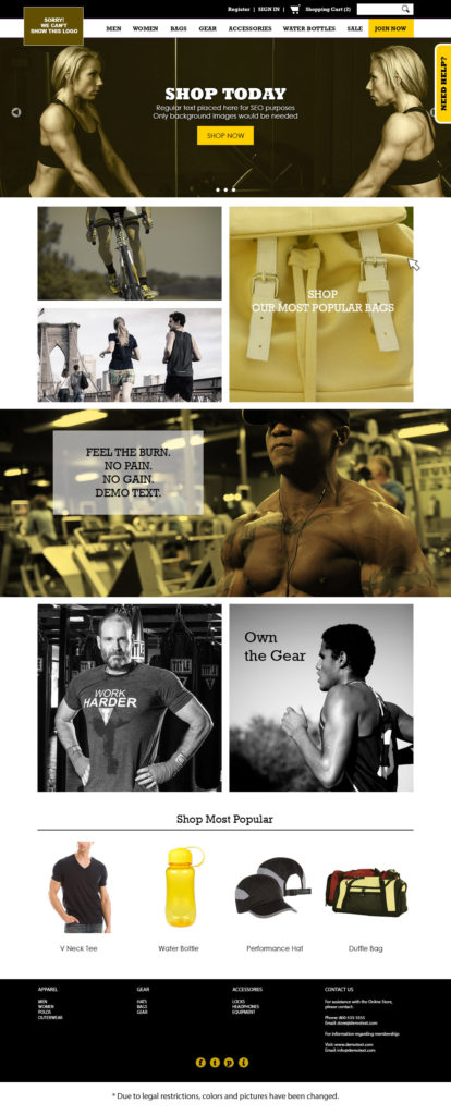
We moved the logo over for them and made it a bit smaller. This allowed more room to add to the navigation area.
Getting rid of the clunky design and giving them a simpler home page layout proved to be a positive thing. Users can find what the client wants to showcase faster.
We got rid of the need for 2 websites by making making it responsive.
Conclusion:
One of the most intense and fun projects ever! Probably the best part of this design and implementation was showing it to the client and have an astounding “WOW! You did what we always wanted to do!”
The best part of this for them was the responsive design. They always ignored their mobile site since there was very little to it. This made it possible to pay attention to their mobile customers, who were over 65-70% of their traffic! That’s huge!
This project was a learning experience as well. We used scripts that we thought would fail, but they worked better than we hoped! The mobile experience became a highlight just from the responsive experience alone.


